Have you heard of the “Death by PowerPoint” movement? I’m not sure you could actually call it a movement, but it’s a way to summarise the many people who are fed up of being bored senseless by business presentations – most often delivered with PowerPoint.
After the software itself, bullet points are the “Death by PowerPoint” movement’s #2 enemy. It’s understandable, because most bad presentations overuse bullet points.
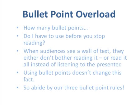
In most bad business presentations, slides are crammed full of text, often using bullet points to give the illusion that the text is split up and easy to digest. They might force ten bullets onto one slide – or only manage to add one or two because there’s so much text on each point.
I don’t blame bullet points for this problem – bullets can be a great way to structure ideas and information on a slide, if they’re used correctly. So to help presenters to use bullets in presentation slides without confusing or distracting the audience, we’ve come up with three simple rules.
How to Use Bullet Points in Presentation Slides
 If I could force every presenter to improve their presentation skills, I wouldn’t ban bullet points – but I’d definitely create some rules bullet point users had to abide by:
1. Use Three Words Per Bullet
A bullet point should be a quick summary of an idea. If you can’t sum an idea up in a few words, you should be dedicating more than just a bullet to it. Forcing yourself to summarise an idea in a few words overcomes the common presentation trap of supervised reading.
2. Use Only Nouns and Verbs
Cut out filler words which don’t add to the meaning of your point, like adjectives and connectives like ‘and’. Bullets are supposed to be in note form – you don’t usually need to add the little words which turn it into a sentence.
3. Use Only Three Bullets per Slide
As I often say, too much information on a slide confuses an audience, because they don’t know where to look. Show too much text, and your audience will:
- Ignore what you’re saying, while they try to read it all.
- Finish reading before you’ve finished speaking.
- Wonder why you’re still rattling on about something they already understand, because they’ve read the information on screen.
I doubt I’ll ever become Presentation President of the World…but if I do, this law will definitely be a part of my mandate.


