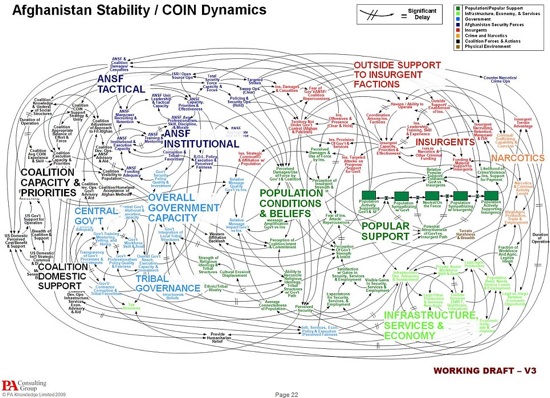
You might have seen this slide before, as it’s often used as an example of the worst presentation slide ever. You can see why, I’m sure. But sometimes analysing extremely bad examples can help us to understand how we can improve our own presentations – even when we have (I hope) much better slides to begin with.
This slide comes from a presentation created by the US military for a discussion about (apparently) the Afghanistan war. One of the audience members is famously reported to have commented on the slide, “When we understand that slide, we’ll have won the war.” Is it the ‘worst presentation slide ever’? And if so, what makes it so bad?
What’s the Point?
In a presentation, the audience is concentrating on listening to what the presenter is saying, so they have little time or brain capacity to devote to understanding slides. For that reason, slides should have one clear, simple message which the audience can understand at a glace, allowing them to devote their attention to the words of the presenter.
You could spend 30 minutes staring at this diagram in silent room, and still not understand it’s point.
Where Should I Look?
One of our top presentation rules is ‘remove clutter’. Why? Clutter confuses the audience because they don’t know where to look. If the presenter says “as you can see from the picture” and there are five pictures on screen, the clutter is diluting the message and distracting the audience.
Simple slides give the audience one thing to look at – focusing their attention and making the most of an opportunity to provide visual back-up to the presenter’s verbal message (see more on visual and verbal channels).
What Does it Say?
I don’t know how big a screen this diagram was shown on; but I doubt the audience could read all of it’s text. If you’ve got so much clutter that your text is too small to read, what’s the point of it? Again, removing clutter improves presentations by allowing the information you do show to be big, clear and memorable.
Is This the Worst Presentation Slide Ever?
It’s definitely bad. But we can’t know how bad because nobody knows the purpose of the slide. If the message of the slide was simply to say, “this issue is really complicated, and you don’t need to understand the detail”, then the slide was probably effective. It passes Nancy Duarte’s ‘glance test’ because after a second anybody seeing that diagram would think “that’s one complex subject”.
But if the purpose of the slide was to explain the details of the subject, it fails. The audience would not only have no clue what they were supposed to look at or how to interpret all of the information; they’d probably be put off ever delving deeper into the subject.
Perhaps the US Military should be required to read our series on explaining complex concepts.

